Album Artwork

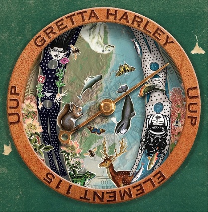
The drawings on the front and back cover are collages commissioned by local artist extraordinaire, Tim Silbaugh of Georgetown Carnival fame and various bands and other projects. Please check out his wonderful work HERE. I chose him not only for his brilliance but for his talent with collage, which well fit the idea I wanted to work with.
I love to work with color and have created comics, but I do not consider myself a visual artist. However, I did have a very strong visual idea for the artwork for this record while recording in St. Augustine. I sketched out the images of a globe and the Nut ladies shaped vertically side by side on top of the globe seen from space with critters at various sizes inside it. Nut is Egyptian goddess of the whole sky and all possibilities. The darker figure is taken from an actual freeware hieroglyphic book I own, and I used her image in a previous band I had back in the mid 90s called the Eyefulls. This image has resonated with me for a long time. I sketched her vertically falling down a road with flowers floating across her face (an image from a song lyric in the cycle). The Nut in negative wearing headphones and having twisted hair is swimming in the opposite direction (also a song lyric), upstream, feet first. The Nuts were originally side by side forming the number “11” which has been a significant number to me since I was a kid. I wanted a circular image with no right side up because when your heart is broken and you are finding your footing again, there doesn’t seem to be an “up” side. Where is Up? "Uup” it turns out is the chemical acronym for “Element 115,” a SHE (Super Heavy Element) which convinced me I had the right title to the song cycle. Tim chose to use a compass as the circle, instead of the globe, which added another level to the symbolism: looking for direction, finding your way.
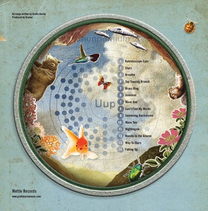
The cover is rich, peaceful and in balance. Many of the images echo the song lyrics contained in the song cycle. The critters chosen are specifically meaningful to me. The back cover is a beautiful landscape and meant to be the backside of the compass, and Tim had the idea to use the atomic diagram of Ununpetium (Uup) inside the compass back- which I thought was brilliant- and then to use the atomic circle shapes to number the song titles.
I wanted there to be an image of something blowing up (analogy to the end of the relationship) which is shown on the cover of the inner lyrics booklet. The mountain taken from the back of the CD is now a blown volcano, sending all of what is precious into chaos; and we find some of those critters inside the booklet alongside the lyrics, while other treasured critters are nowhere to be found. They have fled for the sake of their own preservation. This subtlety is analogous as well. The booklet background in layers of red and hints of green is a painting that I created.


